I've decided to analyze Jacopo della Quercia's article "9 Inventions that Prove Leonardo da Vinci was a Supervillain" on Cracked.com as a potential source of rhetorical tools. As a new media text, the article utilises both word and image - a choice that seems to be a necessity, since the topic is da Vinci's lesser known inventions, which most casual readers cannot mentally picture without visual assistance. Cracked.com relies upon near-controversy and defiance of social norms as the primary aspect of its website, and the accusation that da Vinci was supposedly "a lot less artist and a whole lot more Darth Vader" fits snugly into its reputation niche. However, instead of churning out a story based on shock value alone, Cracked.com peppers its articles with statistics and scientific/historical facts. This article on da Vinci proves to be no exception, being staggering in both the fact that Quercia would make such a claim, and that he has the evidence to suggest at adequate credibility. Photos of various sketches and models of da Vinci's inventions garnish a text that muses upon the violent intentions that he must have had in mind. Along with the riveting topic matter, the tone of the article is likewise intended to be arresting to the reader; in classic Cracked fashion, the writing style is heavily laden with a dry sort of humor, sarcasm propelling the reader's interest.
The intended audience is the casual internet surfer, one whom Quercia assumes would know da Vinci primarily for his art. The writer is also aware that this is a reader who is not momentarily interested in serious, formal writing - he is on a comedy/parody website, after all. The images and dark humor thus act in a manner that would better hold a presumably short attention span. The article is also able to be commented on; readers will often leave their impressions or own two-cents. This interactive atmosphere provides another manner in which a reader might be sucked in - the notion of leaving his own tiny web footprint may be a tantalising enough motivation for some readers to read the whole thing.
Thursday, February 11, 2010

Geico.com
After learning about new media and the various ways to reach an audience the website Geico.com really stuck out to me more than it would have before. There really are so many aspects of it that backup the idea of new media. Of course it is no surprise to see the famous gecko, which is quite an icon, on the homepage. I think this attracts the audience because many people know of the gecko and have a connection in their mind with the company already.
A big way in which this site is new media is the interaction the audience has on it. Once on this site one could instantly get a free insurance quote, manage their policy, and report or track a claim. Right from the start the viewer becomes a participant. Also as the viewer scrolls down the screen there are several types of insurances avialable along with a picture; for example, a house, boat, or RV with the relative insurance.
Another thing that really interested me was that there was a link to connect to Facebook to get the quote. It is not uncommon these days to see such links, yet it still somewhat surprised me on such an official site. It just goes to show how they are using that large Facebook audience to gain support. The part of the website that hit me the most though was that people can download free ringtones from it. Yet again this is just a use of technology to get people comfortable with and attract them to the company: free music is a winner!
Cake Wrecks
I chose cake wrecks, because frankly they are pretty hilarious combinations of words and pictures. The pictures alone are pretty great, but then you add the commentary from the author and you end up laughing out loud. The combination of both the alphabetic words and the pictures is what makes this a good blog. If the blog just had pictures it wouldn't be as fun to look at. The cakes would still be unappetizing, but it wouldn't be that funny. The commentary is usually both witty and clever. It takes the cake sort of out of context and makes new images form in the mind as it is compared to what was said. It makes it a great and hilarious read to the audience.
Dove's Campaign for Real Beauty
Dove’s Campaign for Real Beauty was launched in 2004, in an attempt to correct the unattainable stereotypes of beauty that women face every day. Before this assignment, I had seen a few ads for Dove’s campaign but didn’t really know what it was about. To find out more information, I went to Dove’s website, www.campaignforrealbeauty.com. The campaign is targeted towards young girls, in the pre-teen or early teen years. This fact is evidenced when you look at their website, the first thing you see is a collage of young girls, all describing what they think real beauty is. Anyone can contribute to this wall, which formed an instant connection between the viewer and the website. This feature is a reminder to girls everywhere that you are beautiful no matter how close or far away you are to what the media defines as beautiful.
There are many interactive features on the website; I chose to watch Dove’s commercials. These commercials were simple, yet reflected the issues all young girls are faced with. One commercial entitled “Amy” shows a young boy waiting outside Amy’s house. He repeatedly calls her name, but she doesn’t answer. Then the simple phrase, “Amy can name 12 things wrong with her appearance” flashes on the screen followed by a shot of the boy still waiting outside Amy’s house with the phrase, “He can’t name one”. I know it’s really cheesy, but I loved it! (If anyone needs an awwwww! moment here’s the link: http://www.dove.us/#/features/videos/default.aspx[cp-documentid=8354359]/) The commercial encourages you to let someone know you think they’re beautiful. This video is so simple, but the message is powerful. It shows young teens at a time when they are extremely susceptible to the influences of the media and allows the viewer to put themselves in their position. This campaign encourages us to forget the negative influences of the media and to embrace beauty for what it really is.
One of the main goals of Dove’s campaign is to raise the self-esteem of young girls. To do this, there is a section of the website entitled “Psst…these tools are for girls only!”. This section of the website invites girls to take self-esteem quizzes and to play interactive games aimed at understanding what the media is doing to distort our perception of beauty. This section has a simple layout, full of interactive features to explore. This layout is feminine, yet not overly girly as to put off some of the less pink-loving females. The simple and fun layout of this section would be appealing to any girl.
Dove’s website is targeted towards young girls and effectively shows how the media has damaged girls’ self-esteem. The simplicity and interactive nature of the website make it both entertaining and appealing.
Real Beauty
On the great web page for Dove, there is a section specifically for the "Campaign for Real Beauty" which is what I want to focus on my my analysis. It is mostly focused on getting in contact with women and girls of all ages and races, though it does target younger girls (pre-teens and teenagers) more heavily. The motivation behind this campaign is for women every where to believe that they are indeed beautiful in their own way; the media has been feeding them complete garbage about what beauty is and that it is now time to relearn what beauty really is.
This site is a very interactive one. Whenever the cursor rolls over something it highlights it or makes the icon bigger, promoting and enticing the viewer to dig a little deeper in the website and learn a little more. When the webpage is first opened there is a collage of images of young girls' faces, and if the viewer clicks on one they can hear that girl's story about her beauty. From the very begining the viewer is introduced with real life stories that can promote them to surfer the website a little longer. As a viewer there are many opprotunities and chances to add your own thoughts. You can post your own video of your own story about beauty and self-esteem. You can also comment on just about any article that is poster. There are also links on the sides to join the twitter and Facebook groups to follow the Dove Campaign. If you dig a little farther one will also find quizzes to take and blogs to comment on. There are even educational "games." These of which are focused on appealing to the younger generation.
Throughout the webpage, many photos of women and girls of all shapes, sizes, ages and races are portrayed, reiterating the idea that real beauty is found in the "average" woman. The background color is a soft blue and the icons are all in white, contrasting in a way that attracts the viewer to click on the articles.
Everything about this webpage is focussed on interacting the viewer and having them eventually participate in the Campaign For Real Beauty.
http://dove.msn.com/#/cfrb/
Wednesday, February 10, 2010
We love to see you smile!

Well first off, I want to say that this Picture does not resemble me; Emotionally, Mentally, Physically, or anythingly. (yes I made up that word)
So when I saw this Image of "The McPeace Bringer" I at first was shocked and and laughing at the same time. This image causes that reaction because it is shockingly comical because of how they took a childhood memory for all, and turned him into this "superhero" that looks wicked scary. Then gave him the satire name of "The McPeace Bringer". I find it satire because they perfectly take just enough from the original happy, smiling Ronald McDonald and give him a new name of the McPeace Bringer when he doesn't look peaceful at all.
I find this image to be awesome... I think that is does a great job at making someone laugh or chuckle while leaving them kinda shocked.
http://earthclanelite.com/Winners/most-comical.jpg
September 11th
 I choose this photograph, taken by Thomas E. Franklin, because of the emotional impact it had on Americans. To me it is a very visually stimulating image. The bright colors of the flag contrast heavily with the dominant grays. While not totally covered in gray, the firemen are a part of that visual contrast.
Franklin capitalized on the juxtaposition of the simply majesty of the American flag against the carnage of the fallen wreckage behind the three fire fighters. The fact that the flag pole is partially fallen adds to the effect. The image of the firemen is symbolically saying, "Yes, we have just experienced a tragedy. Yes, America has been brought to it's knees. But we are going to get up." While it may not be seen today, this picture represents the optimism that Americans are traditionally characterized as having.
This photo is similar to another very well known photograph: the US Marines raising the flag at Iwo Jima.

I think one of the main reasons that both of these images have become so powerful is because they represent the solidarity of America to many people. Both photographs create an emotional response within people as they consider the meaning behind the image.
Haiti
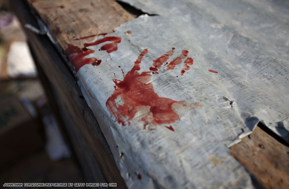
This is a picture from a news clip from CNN about the looting happening in Haiti. This photo is a very powerful one because of its simplicity. The photo has two hand prints made out of blood. These imprints of red are a stark contrast to the metal and wood--two very inhuman substances touching the core of what composes humans. Not only is it powerful, it's persuasive. It makes the audience, the people watching the news or those who are informed of the problems in Haiti, want to know who left the blood covered hand print, or what caused such a thing to happen.
This image is terribly pathetic. It makes me want to weep every time I see it because it reminds me of the newscast that it's from.
Tuesday, February 9, 2010
Chalk Art

This image shows an artists's creativity. I love how a different medium was used, sidewalk chalk! They took a child toy and turned into a masterpiece. The man in the picture, whether the artist or not, evokes the fear of heights as well as creating humor. The angles and geometry required to create images like this take major skill. If you want to see more amazing chalk art, let me know by putting your email in a comment and i'll forward you an email full of them.
CHOCOLATE!!
This picture just makes you want to say "mmmm!"
If this picture doesn't make you hungry, I don't know what will.
After glancing at this picture, I don't understand all of you non-chocolate-lovers out there.
This picture is powerful in that it is definitely appealing, to the tummy! I got this picture off of my sister's blog (don't worry, I obviously have permission). Her's is a blog in which she presents all of her creations. This one happens to be one of my favorite. I think it also is appealing to the eye. It's neat, organized, and clean, with cute colors. This picture would definitely not have the same effect or portray the same message if it was of a gluttonous person stuffing his/her face with
the pie. Though it would prove that someone is enjoying the deliciousness, obviously the audience doesn't get to take part. This picture makes me want to go into the kitchen and try something new, make a beautiful creation, and be satisfied with the result.
The link to her blog is http://www.madebybedtimetales.blogspot.com/. It's a fun open blog to visit!
Freedom of Speech

Norman Rockwell Freedom of Speech
http://www.squidoo.com/norman-percevel-rockwell#module12668476
I absolutely love Norman Rockwell. To me, his pictures represent “American-ness”. This painting entitled Freedom of Speech was inspired by FDR’s State of the Union address in 1941. Norman Rockwell’s audience was the American population in 1941, when the U.S. was unofficially involved in World War II. This picture is part of a set of images that represent the four freedoms FDR outlined in his speech, including the freedom of speech, freedom of religion, freedom from want and freedom from fear. These images show what is important to America and what makes our nation unique. When this image is juxtaposed with the world events of this time (namely, Hitler and his atrocities in Germany), it becomes even more meaningful. This image is powerful to me because it shows an ordinary scene, just a man in a town council meeting speaking his mind. All of the people pictured are regular citizens, listening to what one of their fellow citizens has to say. It reminds us of the power that “we the people” can have in our world. Freedom of Speech also reminds me that this freedom is not something to take for granted, especially when you consider how different our freedoms are from others around the world. People in other countries cannot speak their mind as freely as we do and we should be grateful for the opportunity that we have to voice our opinions.
Exercise or Death

I absolutely love this cartoon! Whenever I think about running and look at this cartoon and it make me think of the need I that I do need to run.....now if I do go running can still depend. But I think the cartoon makes you think just a little more. Just having that picture wont do much and just having the words wont add as much meaning as with the two combined. But having the picture with the words definately makes me think more about exercising! It is intended for an audience who doesn't work out. They are using humor to make a point, trying to make something that is not always enjoyable seem alot better than the other option, of death. The article is found at notgoingout.blogspot.com/
Pumkin Pie

http://images.google.com/imgres?imgurl=http://1.bp.blogspot.com/_wanGigYxLSY/Sw4XFtJynBI/AAAAAAAABps/CjiHduIC92E/s400/Pumpkin%2Bpie.jpg&imgrefurl=http://01mrmotorcycle.blogspot.com/2009/11/how-to-make-pumpkin-pie.html&usg=__9HzbxRx4QF3uNulruFsDvIkPJVc=&h=400&w=300&sz=17&hl=en&start=24&sig2=FDXUhgie2Z8wN9zu-zXX5g&um=1&itbs=1&tbnid=dA3pJTZi6GNCKM:&tbnh=124&tbnw=93&prev=/images%3Fq%3Dhow%2Bto%2Bmake%2Bpumpkin%2Bpie%26ndsp%3D18%26hl%3Den%26sa%3DN%26start%3D18%26um%3D1&ei=vD9yS73FLKbwswO1h_3YAQ
My mother got this picture via mass email, so I figured I could post it because it was sent to about a billion people.
This is a picture of a pumpkin making pumpkin pie. I know it's a little after the holidays to be using this, but when this assignment was posted this was the picture that came to mind. The audience is anyone planning on eating a pumpkin pie. This number I am sure grew smaller. I, myself, did not partake in eating the pie like usual after viewing this. This image is funny because, well the pumpkin looks like it is using the bathroom and out comes a pumpkin pie. It is a pretty humorous picture. The concentration on the pumpkin pie's face is hilarious. It really is funny because the artist takes this somewhat uninteresting holiday food and combines it with other inconspicuous items that altogether make a person kind of grossed out. It's the age old potty humor that usually can make a person crack a grin.
Picante sauce

Don't get the idea that i have anything against babies. I just always get a kick out of this.
This is photoshoped, of course, and the humor is derived from the fact that it is in such contrast to the normal gerber baby foods. On all the other can they have a little smiling baby that is happy. Here, as you can see, the baby is on verge of tears. But the really cool thing is that the aside from the baby, the rest of the image looks nice. its got good light and the picante pepers look asthsetically pleasing.
I can't really imagine gerber actually making anything like this. Which is half the reason it is so funny.
Walk for Life Picture
This picture is from a Pregnancy Care Center Walk For Life. I think it might be referring to abortion. It is a powerful picture because of the contrast that is present. To see the image of an elderly person next to a little baby instantly catches attention I think. It also shows the audience the potential of such a young person to live. I think that in this way it is trying to persuade the audience, or at leaat touch them, with the meaning of life. Yet most people in this audience probably already agree with the importance of life and so this just backs up that passion.
One way in which this touches people is that it shows someone who could be like the viewer's grandfather with a baby that might be their child or niece. This makes it so more personal and the viewer can imagine their own family pictures. The photograh just lifts you up and just reaches out to humans and our wonderul relationships. There is the 'grandpa' with his apron on which just makes the picture so real and can make the audience imagine a family or community barbeque. Bringing together the young with all their life ahead of them and then the older and wiser. It just makes me think of a hallmark card or something. :) It is so simple, but it touches the pathos of the viewer and also the logos because it shows the potential of life which supports anti-abortion views.
Attribution below:

http://www.flickr.com/photos/75088551@N00/ / CC BY 2.0
">
One way in which this touches people is that it shows someone who could be like the viewer's grandfather with a baby that might be their child or niece. This makes it so more personal and the viewer can imagine their own family pictures. The photograh just lifts you up and just reaches out to humans and our wonderul relationships. There is the 'grandpa' with his apron on which just makes the picture so real and can make the audience imagine a family or community barbeque. Bringing together the young with all their life ahead of them and then the older and wiser. It just makes me think of a hallmark card or something. :) It is so simple, but it touches the pathos of the viewer and also the logos because it shows the potential of life which supports anti-abortion views.
Attribution below:

http://www.flickr.com/photos/75088551@N00/ / CC BY 2.0
Down on Yourself?
 DISCLAIMER:
Please forgive me for using a Mormon Ad. I know some of you are thinking that Chelsea is lame for doing this. But you know what? I like Mormon Ads and I think they have good messages. So with that in mind, lets both put aside our differences and move on with our lives.
We all know the story about the ugly duckling (who ironically wasn't even a duckling). The point of the story was that here we have someone who is considered ugly and regeted because he/she doesn't seem to fit in. But later, after a lot of time, the once ugly someone is now magestic, magnifisant and beautiful.
Then there is the mirror. It represents what how we view or see ourselves.
Also, notices the background colors. On one side of the mirror it is black and the other side is light and bright colors. I believe that this is a use of symbolism again. The dark colors representing the negative feelings we have about ourselves, and in contrast the light colors as emotions of what we should be feeling or what we will feel in the future when we become like God.
Often times in our own lives we will feel like we aren't "beautiful." We aren't tall enough, we aren't pretty enough, we aren't strong enough, extra. We then see ourselves as something we aren't; ugly.
This image is trying to protray to us that we are "beautiful" and we should see ourselves as such. We are spirit sons and daughters of God. And God is perfect so therefore he also has a perfect body which means that we will also have one someday as well. And being his sons and daughters means that our spirits must also begin as beautiful. Even though right now our bodies aren't perfect and we may appear to be "ugly", we really aren't. We should see ourselves as what we will be instead of what we are.
The bottom caption reads "Reflect on this: You are a child of God. With His help, you can reach your great potential. (See Rom. 8:16–17.)
Right now we aren't perfect but someday we will be.
So dont' be so down on yourself.
Image by: Graham Ford/Getty Images; Mormon Ads; http://library.lds.org/nxt/gateway.dll/Magazines/NewEra/2003.htm/new%20era%20january%202003.htm/new%20era%20poster.htm
Akbar Risuddin

I don't know if this is just me, but I actually found some humor in this picture. Pictured here are two babies born in Indonesia, one of average weight (left), and one a staggering 19.2 lbs (right). The photo itself accompanied the news story from the Associated Press.
It's not the fact that the 19.2 lb baby (named Akbar) is of an unusual weight that is humorous - his size only makes him seem more adorable to me. It's the way the other baby is gazing at him that prompted my laughter. Despite being only just born, the smaller baby already seems to be struck by the notion that something not quite normal is transpiring; his tiny face shows hints of puzzlement and curiosity. It's the assumed idea that this little baby is already experiencing a moment which defies his marginal logic that brings some unintentional humor to this picture. Also, his confused little face is just priceless.
Tank Man

During the summer of 1989, more than 100,000 protesters gathered at Tiananmen Square calling for economic and democratic reform. On June 4th, the People's Liberation Army responded to the protests with a full out military engagement. Though the figure for how many deaths remains a mystery, it is estimated to be in the thousands.
In the midst of the mayhem, Jeff Widener of the Associated Press was able to capture this moment: a man standing in front of four tanks in defiance. The photo went international overnight and the man was considered a hero. We don't know who this unknown rebel was, but all admire his courage; those tanks could have easily crushed him. The driver just drove around the man.
This picture is also significant because my father was in Tiananmen Square that day. For reals.
You don't bring up Christmas around Batman.
 Since this image can be found on Flickr, Wikiuploads, Digg, etc. I assume it's in the public domain.
This image is obviously intended to reflect the deep, raw emotion of Batman's orphanhood. Or maybe the way we all want to see Robin get the beat down.
It alludes to a story with which most of us are familiar--that Batman has a sidekick and his parents are dead--which forms the basis of the humorous effect. If we didn't know anything about Batman, this image would still be sort of whimsical and Dadaist, but it wouldn't be as funny. Actually, a dude in a cape with glowing white eyes and bat ears smacking another dude in a cape for mentioning his dead parents may be funnier.
It's abrupt, unexpected, and removed from any explanatory context. That's why jokes are funny. When you have to explain them, they're not funny.
Allusion
An allusion is an indirect reference to something that the reader is expected to be familiar with; like a verbal symbol, it carries more significance than it would without that shared experience between writer and reader. Allusion can make writing more concise and powerful, since the writer can convey, in one or two words, and idea that might take a paragraph or more to express.
For example: "Martin Luther King, Jr., alluded to the Gettysburg Address in starting his "I Have a Dream" speech by saying 'Five score years ago..."; his hearers were immediately reminded of Abraham Lincoln's "Four score and seven years ago", which opened the Gettysburg Address. King's allusion effectively called up parallels in two historic moments." --Wikipedia, "Allusion".
Another instance of allusion: "The experience was his Liberty Jail." This allusion would only be meaningful to those familiar with LDS history, and it would be more meaningful to believers. In two words, it conveys the idea of a dark time or a tribulation; but also a turning point, a crucible, a time of spiritual growth. To those familiar with the allusion, it may hold richer meaning than simply to say, "it was a hard time for him" or "it was a growing experience."
Subscribe to:
Posts (Atom)